') center bottom no-repeat;background-size:100%;position:absolute;left:50%;margin-left:-14px;bottom:0;text-align:center}.tiles .tile .fadeout.all{max-height:none;margin-bottom:10px}.tiles .tile .fadeout.all .showall{position:relative;background:none}.tiles .tile .fadeout.all .showall:before{transform:rotate(180deg)}.textis{background:#f6f6f6;padding:80px 0 20px}@media only screen and (min-width: 770px){.textis{padding:70px 0 40px;top:0}}.textis h2{font-weight:600;margin:0 auto 30px;text-align:center}.textis a{font-size:16px}@media only screen and (min-width: 770px){.textis a{font-size:18px}}.ig{padding:0 0 50px 0}.ig-grid{text-align:center}.ig-row{vertical-align:baseline}.ig-row :last-child{vertical-align:top}.ig-item{transition:2s;display:inline-block;height:25vw;width:25vw;background-repeat:no-repeat;background-position:center center;background-size:100% 100%;margin-bottom:20px;margin-right:10px}.ig-item:last-child{margin-right:0;margin-left:10px}.ig-item:hover{background-size:120% 120%}.ig h2{font-weight:600;margin:0 auto 30px;text-align:center}.ig-grid{text-align:center;max-width:1400px;margin:0 auto}.ig-grid a{display:inline-block;padding-bottom:10px}.ig-grid a figure{width:300px;height:300px;margin:0 5px;background-repeat:no-repeat;background-size:150%;background-position:center center}@media only screen and (min-width: 770px){.ig-grid a figure{max-width:250px;max-height:250px}}@media only screen and (min-width: 1170px){.ig-grid a figure{width:280px;height:280px}}.ig-grid a figure img{height:100%}@media only screen and (max-width: 769px){.ig-grid.gsm1 a:nth-child(n+2){display:none}.ig-grid.gsm2 a:nth-child(n+3){display:none}.ig-grid.gsm3 a:nth-child(n+4){display:none}.ig-grid.gsm4 a:nth-child(n+5){display:none}.ig-grid.gsm5 a:nth-child(n+6){display:none}.ig-grid.gsm6 a:nth-child(n+7){display:none}.ig-grid.gsm7 a:nth-child(n+8){display:none}.ig-grid.gsm8 a:nth-child(n+9){display:none}}.hero{top:48px;bottom:0;right:0;left:0}@media only screen and (min-width: 770px){.hero{top:0}}@media only screen and (min-width: 1170px){.hero-slider{padding:0;top:0;bottom:0;right:0;left:0}}.wrap{margin-left:auto;margin-right:auto;padding:0 10px;width:calc(100% - 20px)}@media only screen and (min-width: 770px){.wrap{max-width:770px}}@media only screen and (min-width: 1170px){.wrap{max-width:1440px}}.wrap.inside{max-width:1170px}.c50{display:block}.c50 figure{display:block;margin:0 auto;width:80%;vertical-align:bottom}@media only screen and (min-width: 770px){.c50{padding:100px 0;display:inline-block;vertical-align:middle;width:49%}.c50 figure{display:inline-block;width:80%}.c50.r{text-align:right}}.c50.block{display:block;margin:0 auto;padding:50px 0}.c30{display:block;width:300px}@media only screen and (min-width: 770px){.c30{padding:100px 0;display:inline-block;vertical-align:middle;width:33%}.c30 figure{display:inline-block}.c30.r{text-align:right}}.c60{display:block}@media only screen and (min-width: 770px){.c60{padding:100px 0;display:inline-block;vertical-align:middle;width:66%}.c60 figure{display:inline-block}.c60.r{text-align:right}}.c66{display:block;margin:0 auto}@media only screen and (min-width: 770px){.c66{padding:30px 0;vertical-align:top;width:50%}.c66 figure{display:inline-block}}header{background-color:#f6f6f6;-webkit-box-shadow:0px 0px 10px 0px rgba(0,0,0,.1);-moz-box-shadow:0px 0px 10px 0px rgba(0,0,0,.1);box-shadow:0px 0px 10px 0px rgba(0,0,0,.1);color:#000;height:48px;max-width:100%;margin:0 auto;vertical-align:middle;position:fixed;top:0;right:0;bottom:0;left:0;z-index:5000}@media only screen and (min-width: 770px){header{height:86px;padding-top:10px}}@media only screen and (min-width: 1170px){header{padding-top:20px}}header ul{display:inline-block}header a{text-decoration:none;display:inline-block;font-weight:300;font-size:14px;text-transform:uppercase;letter-spacing:1px}header .header-logo figure{display:inline-block;margin:0 30px}header .header-logo figure img{width:155px;height:auto}header .header-logo.mobile{top:5px;left:20px;width:100px}header .header-logo.mobile figure{top:2px;display:inline-block;margin:0;width:inherit}header .header-logo.mobile figure img{width:auto;height:35px}@media only screen and (min-width: 769px){header .header-logo.mobile{display:none}}header .header-logo.medium{display:none;top:5xp;left:20px;width:100px}@media only screen and (min-width: 770px){header .header-logo.medium{display:block;width:155px}}@media only screen and (min-width: 1169px){header .header-logo.medium{display:none}}header .header-logo.medium figure{top:6px;display:inline-block;margin:0;width:inherit}header .header-logo.medium figure img{width:inherit;height:auto}header .header-logo.desktop{display:none;top:unset;left:unset}@media only screen and (min-width: 1170px){header .header-logo.desktop{display:inline-block}header .header-logo.desktop figure{display:inline-block;margin:0 30px}header .header-logo.desktop figure img{width:198px;height:auto}}header .header-nav{display:none}@media only screen and (min-width: 1170px){header .header-nav{display:block;font-size:inherit;width:auto;margin:0 auto;text-align:center}header .header-nav ul{padding:0;margin:0;top:-20px}header .header-nav ul li{display:inline-block;margin:0 1vw}header .header-nav ul li.active a{border-bottom:2px solid #37474f;height:31px}header .header-nav ul li.active ul li a{border:0}header .header-nav ul.contact{top:-8px}header .header-nav ul.contact li{margin:0}}@media only screen and (min-width: 1440px){header .header-nav ul li{margin:0 2vw}}header .header-meta{display:none}@media only screen and (min-width: 1170px){header .header-meta{display:block;float:right;font-size:inherit;top:calc(2rem - 12px)}header .header-meta a:last-child{font-size:18px;line-height:unset;margin-left:20px;padding:10px 25px;width:auto}}header .header-nav-mobile{display:none;background:#fff;position:absolute;top:48px;left:0;right:0;bottom:0;height:100vh;width:100vw;z-index:100;padding-top:30px;overflow:hidden;overflow-y:auto;margin:0}@media only screen and (min-width: 770px){header .header-nav-mobile{top:86px}}header .header-nav-mobile ul{list-style:none;padding:0;margin:0;display:block}header .header-nav-mobile ul li{list-style:none;padding:0;margin:0}header .header-nav-mobile ul li a{font-size:18px;padding:0 0 0 10vw;line-height:2em}header .header-nav-mobile ul li ul{list-style:disc;margin:0 0 0 10vw;padding:0 0 0 10vw}header .header-nav-mobile ul li ul li{list-style:disc;margin:0;padding:0}header .header-nav-mobile ul li ul li a{padding:0}header .header-nav-mobile ul.contact{padding-left:10vw}header .header-nav-mobile ul.contact li{display:inline-block;margin:0;padding-left:0}header .header-nav-mobile ul.contact li:first-child{margin-left:-20px}header .header-nav-mobile ul.contact li a{padding:0}header .header-nav-mobile ul.contact li a svg{width:75px;height:75px}header .header-nav-mobile-toggle{background:rgba(0,0,0,0);cursor:pointer;display:block;height:50px;margin:0;position:absolute;right:0;top:2px;width:50px;z-index:5;overflow:hidden;padding:0;font-size:0;text-indent:-9999px;box-shadow:none;border:none;transition:background .3s}header .header-nav-mobile-toggle:focus{outline:none}@media only screen and (min-width: 770px){header .header-nav-mobile-toggle{top:8px}}@media only screen and (min-width: 1170px){header .header-nav-mobile-toggle{display:none}}header .header-nav-mobile-toggle span{background:#000;display:block;height:2px;left:0;opacity:1;position:absolute;top:16px;width:16px}@media only screen and (min-width: 770px){header .header-nav-mobile-toggle span{height:3px;width:20px}}header .header-nav-mobile-toggle span:after,header .header-nav-mobile-toggle span:before{position:absolute;display:block;left:0;width:100%;height:2px;background-color:#000;content:""}@media only screen and (min-width: 770px){header .header-nav-mobile-toggle span:after,header .header-nav-mobile-toggle span:before{height:3px}}header .header-nav-mobile-toggle span:after{top:7px}header .header-nav-mobile-toggle.on span{background:#fff;top:12px}header .header-nav-mobile-toggle.on span:before{top:7px;transform:rotate(45deg)}header .header-nav-mobile-toggle.on span:after{bottom:-7px;transform:rotate(-45deg)}header .header-nav-mobile.on{display:block}header .menu-wrap{position:relative}.nav-main{position:absolute;top:14px;left:0}.nav-main-languages{display:none}@media only screen and (min-width: 770px){.nav-main-languages{color:rgba(0,0,0,0);display:inline-block;width:20px}.nav-main-languages:before{background:url("/assets/img/globe.svg") 0 0;background-size:16px;content:"";height:16px;position:absolute;width:16px}}.nav-main-languages-item{display:block}@media only screen and (min-width: 770px){.nav-main-languages-item{display:none !important}}.nav-footer{padding-top:20px}.nav-footer a{text-decoration:none}.nav-footer a:hover{text-decoration:underline}.nav-footer-languages{list-style:none;margin:0;padding:0}@media only screen and (min-width: 770px){.nav-footer-languages{display:inline-block}}.nav-footer-languages li{text-align:center}@media only screen and (min-width: 770px){.nav-footer-languages li{display:inline-block;margin-right:15px;text-align:left}}.nav-footer-legal{list-style:none;margin:0;padding:0;text-align:right}@media only screen and (min-width: 770px){.nav-footer-legal{display:inline-block;float:right}}.nav-footer-legal li{text-align:center}@media only screen and (min-width: 770px){.nav-footer-legal li{display:inline-block;margin-left:35px;text-align:right}}.nav-footer-legal .twitter,.nav-footer-legal .linkedin,.nav-footer-legal .facebook,.nav-footer-legal .xing{display:inline-block;height:auto;margin:0 10px;text-align:center;vertical-align:middle;width:15px}.btn{transition:all .2s ease-out;cursor:pointer;border-radius:0;display:block;font-size:14px;font-family:Avenir,Arial,Helvetica,sans-serif;margin-bottom:5px;text-align:center;text-decoration:none}@media only screen and (min-width: 770px){.btn{display:inline-block;font-size:18px;padding:0 20px}}br+.btn{margin-top:10px}.ghostblack{border:4px solid #000;background-color:rgba(0,0,0,0);color:#000;padding:8px 14px;font-size:inherit;font-weight:400}.ghostblack:hover{background-color:#000;color:#fff}@media only screen and (min-width: 1170px){.ghostblack{border:3px solid #000;padding:5px 10px}}.booking,.booking-mobile{transition:all .2s ease-out;background:none;background:none;border:4px solid #000;font-size:20px;padding:8px 14px;font-weight:400}@media only screen and (min-width: 1170px){.booking,.booking-mobile{font-size:14px;border:3px solid #000;padding:5px 10px;top:-20px}}.booking.modal,.modal.booking-mobile{border:4px solid #fff;color:#fff}.booking:hover,.booking-mobile:hover{background:#000;color:#fff}.booking-mobile{position:absolute;right:100px;font-size:16px;padding:4px 12px;top:6px}@media only screen and (min-width: 770px){.booking-mobile{right:100px}}@media only screen and (min-width: 1170px){.booking-mobile{display:none !important}}.send{transition:all .2s ease-out;background:none;background:none;border:4px solid #000;font-size:20px;line-height:2em;font-weight:700;width:80%;max-width:350px}@media only screen and (min-width: 1170px){.send{font-size:18px;border:3px solid #000}}.send:hover{background:#000;color:#fff}.callpopup{height:0;font-size:0;opacity:0}.popup{display:none;position:absolute;top:20vh;left:50%;font-family:Avenir,Arial,Helvetica,sans-serif;font-size:24px;text-align:center;line-height:32px;width:300px;margin-left:-150px;padding-bottom:2rem;z-index:50;-webkit-box-shadow:0 2px 6px 9px rgba(0,0,0,.2);-moz-box-shadow:0 2px 6px 9px rgba(0,0,0,.2);box-shadow:0 2px 6px 9px rgba(0,0,0,.2)}@media only screen and (min-width: 770px){.popup{width:600px;margin-left:-300px}}.popup .btn{border-radius:2px}.popup .popupclosebtn{width:24px;height:24px;position:absolute;border:0;cursor:pointer;right:20px;top:20px;background:center center no-repeat;z-index:2}.popup .popupclosebtn.popupclosebright{background-image:url('data:image/svg+xml;utf8,')}.popup .popupclosebtn.popupclosedark{background-image:url("data:image/svg+xml,%3Csvg width='13' height='13' xmlns='http://www.w3.org/2000/svg'%3E%3Cpath d='M2.042575 12.567585l4.20741-4.208212 4.207792 4.20783c.243377.243339.638274.243339.882032 0l.977743-.977743c.243339-.243377.243339-.638273 0-.882032L8.10934 6.500018l4.20783-4.207792c.243339-.243377.243339-.638274 0-.882032l-.977742-.977743c-.243377-.243339-.638274-.243339-.882033 0l-4.20741 4.208212L2.042193.432833c-.243377-.243339-.638273-.243339-.882032 0L.1828 1.410194c-.243339.243339-.243339.638274 0 .882032l4.20783 4.207792L.1828 10.70781c-.243339.243377-.243339.638273 0 .882032l.977743.977743c.243377.243339.638273.243339.882032 0z' fill='%25232424242' fill-rule='nonzero'/%3E%3C/svg%3E")}.popup .popupbtndark,.popup .popupbtnbright{margin-top:1rem;font-size:20px;padding:.1em .3em;border:0}.popup .popupbtndark{background:#000;color:#fff}.popup .popupbtnbright{background:#fff;color:#000}.popup .popupcontent{padding:3rem 1rem 2rem}.popup.bgdark{background:#242424;color:#fff}.popup.bgbright{background:#fefefe;color:#000}.popup figure{z-index:-1}.popup h2{margin-top:1rem;margin-bottom:2rem;font-size:24px;font-family:Avenir,Arial,Helvetica,sans-serif}.popup p{font-size:18px}.popup ul{padding:1rem 0}.popup ul,.popup ul li{list-style-type:initial;list-style-position:inside}@-webkit-keyframes swing-in-top-bck{0%{-webkit-transform:rotateX(70deg);transform:rotateX(70deg);-webkit-transform-origin:top;transform-origin:top;opacity:0}100%{-webkit-transform:rotateX(0deg);transform:rotateX(0deg);-webkit-transform-origin:top;transform-origin:top;opacity:1}}@keyframes swing-in-top-bck{0%{-webkit-transform:rotateX(70deg);transform:rotateX(70deg);-webkit-transform-origin:top;transform-origin:top;opacity:0}100%{-webkit-transform:rotateX(0deg);transform:rotateX(0deg);-webkit-transform-origin:top;transform-origin:top;opacity:1}}.cookieConsentContainer{z-index:999;width:350px;min-height:20px;box-sizing:border-box;padding:30px 30px 30px 30px;background:#37474f;overflow:hidden;position:fixed;bottom:30px;right:30px;display:none}.cookieConsentContainer .cookieTitle a{font-family:Avenir,Arial,Helvetica,sans-serif;color:#fff;font-size:22px;line-height:20px;display:block}.cookieConsentContainer .cookieDesc p{margin:0;padding:0;font-family:Avenir,Arial,Helvetica,sans-serif;color:#fff;font-size:13px;line-height:20px;display:block;margin-top:10px}.cookieConsentContainer .cookieDesc a{font-family:Avenir,Arial,Helvetica,sans-serif;color:#fff;text-decoration:underline}.cookieConsentContainer .cookieButton{display:inline-block;margin-right:20px}.cookieConsentContainer .cookieButton a{display:inline-block;font-family:Avenir,Arial,Helvetica,sans-serif;color:#fff;font-size:14px;font-weight:bold;margin-top:14px;background:#000;box-sizing:border-box;padding:15px 24px;text-align:center;transition:background .3s}.cookieConsentContainer .cookieButton a:hover{cursor:pointer;background:#00796b}.cookieConsentContainer a.cookieNo{cursor:pointer;color:#fff;display:inline-block;font-size:14px;text-decoration:underline}@media(max-width: 980px){.cookieConsentContainer{bottom:0px !important;left:0px !important;width:100% !important}}.main-hero{text-align:center}.main-hero h1{text-align:center}.main-hero p{text-align:left;font-size:15px;padding:0 10%}@media only screen and (min-width: 770px){.main-hero p{font-size:17px}}@media only screen and (min-width: 1170px){.main-hero p{font-size:18px}}.main-hero form{display:inline-block;text-align:left;margin:0 auto;width:calc(100% - 40px)}@media only screen and (min-width: 770px){.main-hero form{width:auto}}.main-hero form p{padding:0;width:auto}.main-hero form input{margin-bottom:5px}.main-hero .btnred{display:block;margin:0 auto}.main-whoelse{background:#ECEFF1;padding:80px 0;text-align:center}@media only screen and (min-width: 770px){.main-whoelse{padding:80px 0}}@media only screen and (min-width: 1170px){.main-whoelse{padding:100px 0}}.main-whoelse h2{padding:0 0 60px;text-align:center}@media only screen and (min-width: 770px){.main-whoelse h2{padding:80px 0}}.main-whoelse figure{display:inline-block;width:16%;vertical-align:middle}.main-whoelse figure img{width:auto;height:auto;max-width:70px}.main-blog{text-align:center;padding:0 0 20px 0}@media only screen and (min-width: 770px){.main-blog{padding:0 0 80px 0}}@media only screen and (min-width: 1170px){.main-blog{padding:0 0 100px 0}}.main-blog h2{padding:0 0 20px}@media only screen and (min-width: 770px){.main-blog h2{padding:80px 0}}.main-blog h3{font-family:Avenir,Arial,Helvetica,sans-serif;font-weight:normal;font-size:16px;line-height:27px}@media only screen and (min-width: 770px){.main-blog h3{font-size:20px}}.main-blog article{vertical-align:top;display:inline-block;height:130px;overflow:hidden;padding:5%;margin-bottom:40px;text-align:left;width:calc(100% - 20px)/3;color:#263238}@media only screen and (min-width: 770px){.main-blog article{width:22%}}.main-blog article:hover{background:#F5F7F8}.main-blog a{text-decoration:none}.main-blog a small{color:inherit;line-height:20px}@media only screen and (min-width: 770px){.main-blog a small{line-height:27px}}
Toggle Menu
Like guests with friends
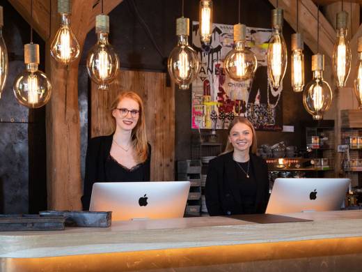
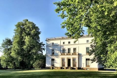
200 year old ceiling beams, country-style oak floorboards, an open fireplace – on entering the country manor, you immediately sense the heritage of the former courtyard. In the Here and Now, it has been transformed into a place for feel-good moments – probably the most relaxed boutique hotel in the whole town. A puristic design with plenty of space, light and warmth. The passion Nils Jacobsen and his team are running the hotel with, is felt in every detail. Casual luxury reduced to its essentials.
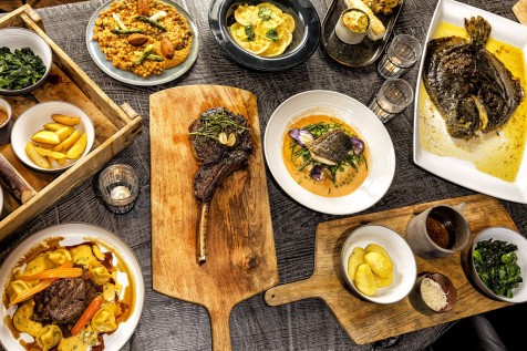
At HYGGE, the heart and soul of the country manor, we are celebrating the unique Scandinavian lifestyle each and every day. During a lovely meal with your family and friends our motto is: unwind, relax and enjoy the moment.
Sleep
Relax
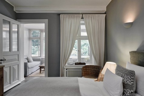
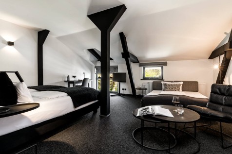
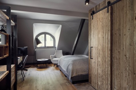
You will find many individual havens of tranquility at Landhaus Flottbek. With high-quality box-spring beds and luxurious extras such as Rituals-products and a glass of port upon arrival. Simply choose your favourite look from our 26 rooms and pick your preferred room-size.
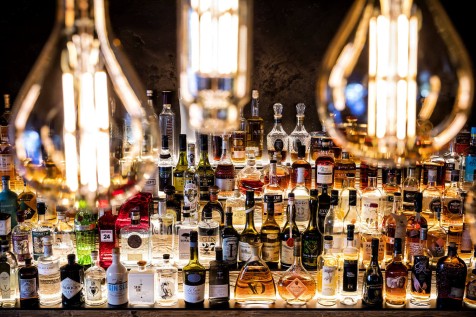
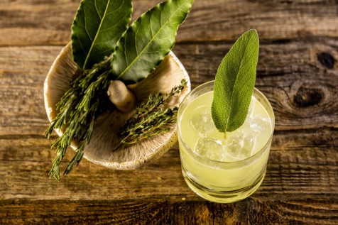
HYGGE, our multiple award winning restaurant, is THE ultimate hangout in Hamburg, serving families, friends, business partners or the odd casual acquaintance as a restaurant, bar and hotel-living room at the same time.
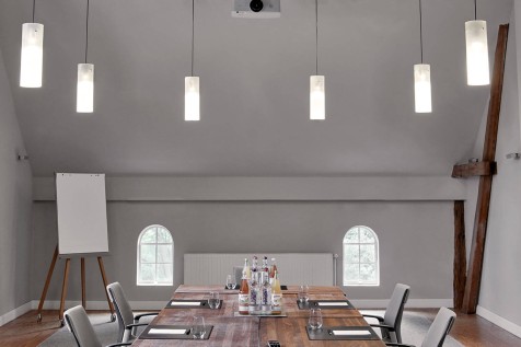
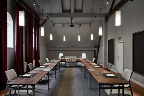
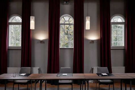
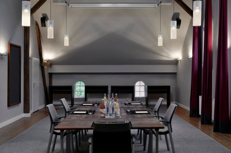
Seminars, workshops, conferences – we offer the perfect environment for your business event. On top of technical equipment and work material, we happily provide you with some hyggelig catering from our restaurant.
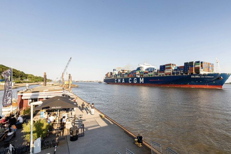
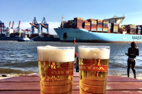
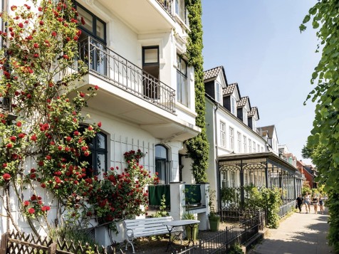
The Landhaus Flottbek is located in the green quarter of Gross Flottbek in the suburbs of Hamburg, with a direct transportation link to the city centre. It will only take a 15 minute ride on the S-Bahn to get there, but you can also use one of the “Elbe-Barges” and enter the port of Hamburg the traditional way.